
4 Keys to Great Presentation Design
Presentations are a great way to educate others about a new idea, or persuade an audience that your opinion is the right one. They are effective tools for communicating with large groups of people; it's one thing to communicate your thoughts on a new project to your coworker, and quite another wh...
Presentations are a great way to educate others about a new idea, or persuade an audience that your opinion is the right one. They are effective tools for communicating with large groups of people; it's one thing to communicate your thoughts on a new project to your coworker, and quite another when you are talking to your whole department.
Presentations are a great way to educate others about a new idea, or persuade an audience that your opinion is the right one. They are effective tools for communicating with large groups of people; it's one thing to communicate your thoughts on a new project to your coworker, and quite another when you are talking to your whole department.
Seventy-four percent of respondents to the 2017 Annoying Presentation Survey stated that they were seeing about two presentations created in Microsoft's PowerPoint per week. That's roughly 104 presentations a year! How can a presenter ensure their audience retains the information they worked so hard to collect?

There are four keys that will help your audience follow along and remember your presentation: content, audience, structure, and consistency.
Choose your content
When developing a presentation, the first thing to do is decide on what you're presenting. Choose a single subject; by focusing on a small amount of information, you won't overwhelm your audience. This also gives them the time and opportunity to really understand the position or reasoning on why you are giving a presentation in the first place.
Start by creating a high-level outline that captures three main ideas about the topic you are presenting on. At this stage, you don't have to get too into the weeds on what your presentation will include; just sketch out the idea and some supporting statements. This information can later inform what topics to include or ignore, visuals, and, in the end, how many slides you're aiming for.
Do note that many people often say "less is more" when it comes to the number of slides in a presentation. There is an oft-cited myth that humans have a limited attention span thanks to technology—this is false! You will not lose your audience's attention because they are unable to focus; you will lose their attention because you have a boring or confusing presentation.
By knowing your message, you'll be able to create a powerful presentation that focuses on the essentials.
Understand your audience
People change their way of speaking when talking with a child versus when talking with an adult. It's the same in the workplace; you might be more informal with a coworker with whom you are close. Then you would speak another way with your boss or the company's CEO.

But there's more to think about when it comes to understanding your audience: what's their background, and level of familiarity with the subject? What is their educational background? Is the subject something they would be naturally interested in, or do you think a particular idea will meet with some resistance?
Taking some time to think about how your audience will react to the information tells you how it should be presented. If your audience is brand new to the subject, you might want to take some time discussing background information. Let's walk through an example: talking to a group of executives about web design. They will probably be unfamiliar with UI/UX, back end versus front end, or what a server is. Educating them about these terms can help support an argument that spending more time on the UX will result in more sales simply because your audience understands you.
If you were to give the same presentation to a group of web designers, you'll probably bore them to death, and instantly have all eyes dropping to phone screens the moment you reveal your cover slide. Understanding your audience will tell you what areas are of most importance and should have some of your valuable presentation time. It will also tell you what is unimportant and should not be included in a presentation.
Develop the structure
Once you know the what and how, you can plan out your presentation. This is where you decide what content will go on each slide, in what order. Some good rules of thumb:
One idea, one slide
Keep the content of each slide focused on a single idea that supports the subject you're discussing. This information should be straightforward and easily summarized by a visual. More information has the potential to easily become too much text, which can become a problem of its own. One big complaint mentioned in the 2017 Annoying Presentation Survey was that presenters often ended up simply reading their own slides. When that happens, you know the presentation should have been an email.
Cut down on the text
Continuing the same thought from above, less text means there's less of a chance that your audience will become overwhelmed and mentally check out, constantly looking at their watch for when your presentation will end. Trying to include too many thoughts on one slide is the fastest way to intimidate and scare away your audience. Keep it simple, and keep it focused.
Clear is more
As we said before, don't concentrate on keeping the number of slides in your presentation to a minimum; use as many slides as are needed to fully explain the idea. A good rule to work by is one slide per minute you have to present in; so if you have 30 minutes, use 30 slides. The important thing to focus on is ensuring your slides themselves do not overwhelm the audience with content.
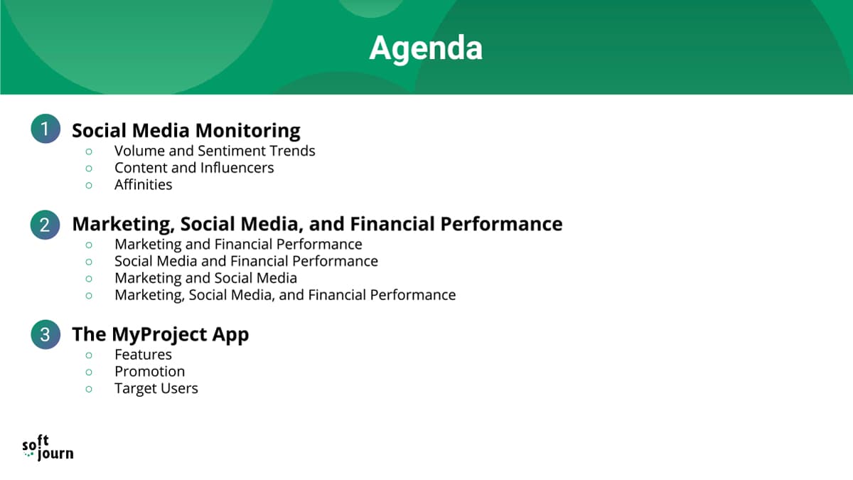
Provide a map
One great way to keep your audience focused on your presentation is to tell them where you all are within the presentation. This can be done with slides that are structured like a document's table of contents, or a high-level agenda. They can be placed between sections to show what has come before, and what's still to come; or they can be included in the design of the slides themselves, such as in a header or footer on the slide.
This way, if you do end up having a presentation with a lot of slides, your audience won't be staring at the ceiling; they'll be staring at your presentation, curious about where all of this is leading.
Visuals, visuals, visuals
You know that saying that a picture is worth a thousand words? It might be a cliché at this point, but that doesn't make it any less true. Visuals can say a lot in just one glance that would otherwise take readers some time to understand. And when you know your topic, you can create really impactful visuals—whether using charts, icons, or graphics, you can bring your presentation to life and wow your audience with something beautiful to look at.
One such tool that can be extremely effective in creating striking visuals is an image background remover. This can be used to isolate the subject of a picture, thereby removing any distractions within the frame. By doing so, you simplify the image and draw attention to the part that truly matters. This can be particularly useful when you're trying to highlight or emphasize a certain point in your presentation.
Be consistent
One of the most important things in the presentation development process is creating a presentation theme that is consistent. When your slides vary in size, display, or structure, audiences can become confused or distracted, which means they're not paying attention to your message. You can create a consistent theme by doing the following:
Choose a color scheme
Choosing a good color scheme might be one of the most important parts of developing a good presentation, right under understanding your content and your audience. Differing colors are a great way to draw your audience's attention, and incite particular emotions when discussing different ideas. However, this doesn't mean you should use whatever color strikes your fancy all at the same time. Choose a handful of colors for a particular and impactful color scheme.
Colors should be complementary, and draw the eye to particular parts of the screen that you want your audience to pay attention to. Choose your colors purposefully! And if the text will sit on top of a particular color, ensure that the two don't cancel each other out. You want colors that work together that still allow text to be read and ideas understood.
Use readable fonts
Picking a great font is very important; aside from visuals, text is the other way you're going to get your message across. There are two types of fonts: serif and sans-serif. Serif fonts have small, decorative flourishes, whereas the sans-serif fonts do not (thus, "sans" serif, or without).
Choose a font family that is easy to read; san-serif fonts are typically easier to read when it comes to presentations and digital content because of the dots per inch (DPI). Printed works have 300 DPI, whereas computer monitors typically have 100 DPI. This makes serif characters more difficult to read because of their complex shape.
Sans serif font:
The Quick Brown Fox Jumps Over The Lazy Dog
Serif font:
The Quick Brown Fox Jumps Over The Lazy Dog
Some of the most popular sans-serif fonts are Helvetica, Verdana, and Arial.
Stick with the same layout
The way content is structured on a page is often called a grid, frame, or layout. When developing your presentation, it's good to use consistent layouts for the same kind of slides. For example, use one type of layout for the cover slide; keep all section intro slides consistent; and all content slides consistent. This way, your audience knows where to look, what information is important, and can follow along easily as you present. If your audience is constantly searching for pertinent information on the slide in front of them, that means they're not listening to you talk!

Cheat Sheet for a Good Presentation
Creating a compelling and engaging presentation requires careful planning and design. To assist in this process, we've compiled a "cheat sheet" for good presentation design, which includes three essential tables.
The first table outlines the ideal content structure, from the introduction to the conclusion, ensuring your narrative is clear and engaging.
The second table emphasizes the presentation skills that every presenter should hone, such as clarity, confidence, and time management.
Lastly, the third table offers guidance on visual elements, such as slide design, use of images, and font and color choices. Utilizing this cheat sheet will help guide your presentation design, helping you create a visually appealing, well-structured, and engaging presentation that effectively communicates your message.
Content Structure:
Element | Description |
|---|---|
Introduction | Sets the stage and gives the audience an idea about the topic |
Main Points | The key ideas you want to convey |
Supporting Evidence | Data, anecdotes, or examples that validate your main points |
Conclusion | Summarizes the key points and provides a call-to-action |
Presentation Skills:
Skill | Importance |
|---|---|
Clarity | Essential for the audience to understand the message |
Confidence | Makes the presenter appear knowledgeable and trustworthy |
Body Language | Helps to engage the audience and convey non-verbal cues |
Time Management | Ensures all points are covered without rushing or overrunning |
Visual Elements:
Element | Role |
|---|---|
Slides Design | Should be clean and uncluttered for readability |
Use of Images | Can enhance understanding and retention |
Charts and Graphs | Useful for explaining complex data |
Font and Colors | Should be chosen for readability and consistency with the topic's tone |
Let's wrap up
As you can see, a lot of work goes into a good presentation. There are many factors to consider to ensure your message is being heard loud and clear. But don't feel overwhelmed! Most of these steps build on one another, like how picking one topic to focus on and understanding your audience tells you how to structure and present your material.
Once you've got it all together, the best thing to do is go through the material with a dry run. By practicing, you're making sure that you're not missing any gaps or have accidentally left in any unnecessary material. It also makes sure that you know your presentation; this helps you avoid reading off the slides, and can help abate presentation anxiety.
Making a presentation is more than just slapping a few slides together, but with Softjourn's tips about presentation structure and design, you too can create a stellar presentation. Let us know in the comments which you found most helpful, or add your own ideas!